
In this blog post we’ll explore some common user interface patterns for navigation inside mobile apps. These are well understood models you can follow when developing your own solution, your users will already know them well for most mobile apps follow these practices. So, in the end, I’ll not be telling you anything groundbreaking or new, but maybe you never really stopped to think about such patterns and even though you’ll recognise them all, you’ll still learn a lot by focusing on when to use them and how to implement them in Appli.
Navigation here means how the user moves around inside your app.
Flat Navigation
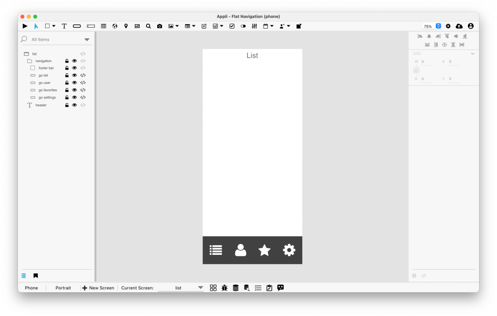
A footer holding buttons used for navigation
This is probably the most common pattern used this day. The application has distinct capabilities or main features that can be accessed via a toolbar. These capabilities don’t have a hierarchy between them. One screen is not necessarily more important than another, and the user can move freely between them.
In this kind of navigation, the switch between toolbar items only happens if the user clicks on an item. You app doesn’t move them from one of those screens into another. You can still have multiple screens that belong to the same feature.
On tablets, that navigation bar usually take the form of a sidebar on the right side of the screen depending on the language.
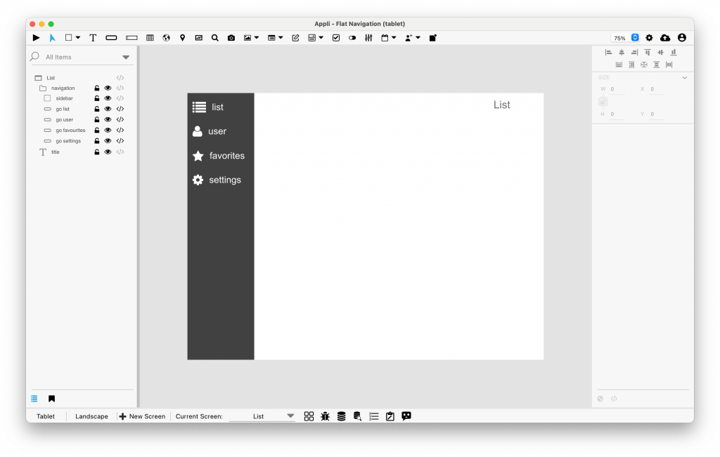
On tablets, a sidebar provides the navigation
An example of this navigation is the dialer application on iOS. The bottom navigation has Favourites, Recents, Contacts, Keypad, and Voicemail. Each item unlocks a different workflow in that app.
To implement a flat navigation using Appli is easy. Just create one or more screens per-workflow or feature. Use a group of buttons to navigate between those screens.
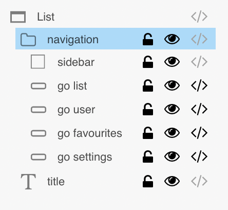
You can add that group to the asset manager thus making it easy to update the navigation and to place the group in new screens.
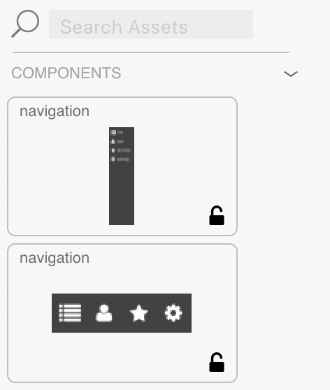
Asset manager showing components for tablet and mobile phone navigation
Drill-down Navigation
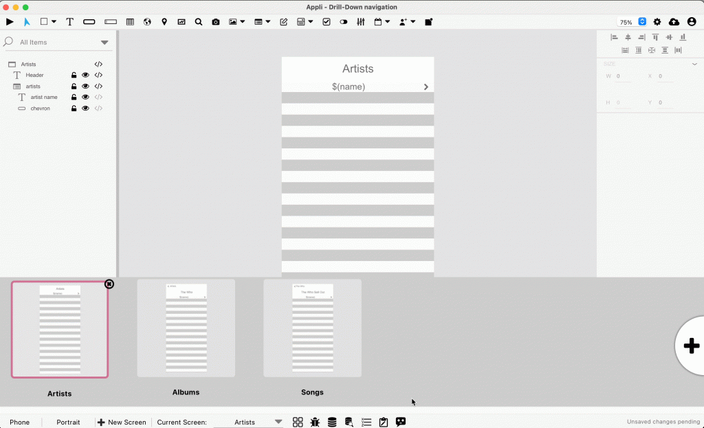
Another common way to navigate in an app, this usually takes form of an array of choices that is used to narrow the scope or choice the user is making. It is usually a good way to navigate through hierarchical data such as database records or dates.
Usually this is represented by columns that can fill the whole screen when working on a mobile phone or be stacked one next to the other when working with a tablet in landscape orientation. Each choice filters the available choices on the next screen, such as going from year, to month, to date, or finding a song by first selecting an artist and then the album.
The easiest way to develop this workflow in Appli is by making each choice their own screen and using variables to select and filter data between them.
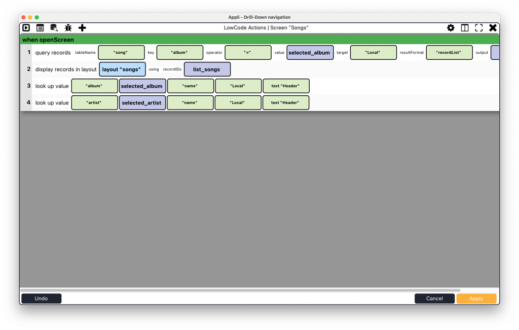
filtering records to show based on variables from the previous screen
Hub-and-Spoke Navigation
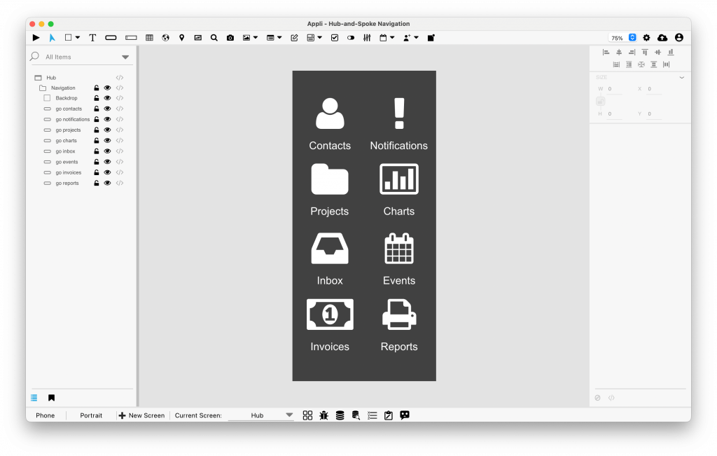
The iOS home screen and some Android home screens follow this pattern. There’s a hub screen full of buttons that give access to various distinct features. Such as a grid of app icons that allow you to launch individual apps.
Mainstream apps don’t usually follow this pattern, but I have seen many corporate internal-use only apps use it as different groups develop modules independently and they’re all combined in a large app.
Implementing this in Appli is simple, a hub screen is created that gives access to the various features. Moving from one feature to the other involves going back to the hub screen.
When to use each type?
It really depends on who is your audience and what kind of app you are building, but the flat navigation system is quite flexible and will serve most cases. If you end up having so many features that fitting them all into a toolbar becomes hard, you might consider going with hub-and-spoke. In case your workflow circles around navigating through data or narrowing choices, then the drill-down navigation might be the obvious choice.
This post has been inspired by Modern iOS Navigation Patterns blog post.