One of the challenges that we face as mobile app developers is that our users may have devices with different screen sizes. On the iOS side, Apple’s latest iPhones vary from 1334×750 px to 2796×1290 px. On the android side, the spread is even larger, especially with so many different manufacturers. We usually design our apps for a specific screen size, so what happens if our users have a phone with a different size? Worse, what if their phone has a significantly different aspect ratio?
In Appli, the main way we can handle different screen sizes is via the “geometry” section of the property inspector. These geometry properties define how an element should change its size and position based on its container’s (i.e. the screen) size and position. This allows us to change how elements are sized and placed when a user’s screen size differs from our initial design’s screen size.
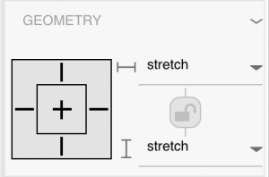
By default, Appli sets all element’s geometry on both the X and Y axis to “stretch”. This means that as the screen’s width or height increases, every element will stretch proportionally, while maintaining the same relative position (by percentage).
Most of the time, this is exactly what we want. We will still show all of the elements on screen, possibly a little smaller or larger that what we originally had.
However, there are some times when you might not want to change the size of an element, or you might want an element to be anchored in a particular way regardless of the screen size. In those cases, we can change our geometry properties.
Horizontal Geometry options
For the horizontal dimension, (x-axis) there are 5 different options: Left, Center, Right, Left & Right, and Stretch.
Left – The element will not change its width, and its left edge will stay the same distance from the screen’s left edge.
Center – The element will not change its width, and the distance between its center and the screen’s center stay the same.
Right – The element will not change its width, and its right edge will stay the same distance from the screen’s right edge.
Left & Right – The element’s left edge will stay the same distance from the screen’s left edge, and the element’s right edge will stay the same distance from the screen’s right edge. This means the element’s width will change.
Stretch – The element’s width will change, maintaining the same percentage of width of the screen. The distance between the element’s left edge and the screen’s left edge will maintain the same percentage of the screen’s height, as will the distance between the element’s right edge and the screen’s right edge.
Vertical Geometry options
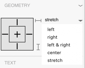
For the vertical dimension, (y-axis) there are also 5 options: Top, Center, Bottom, Top & Bottom, and Stretch.
Top – The element will not change its height, and its top edge will stay the same distance from the screen’s top edge.
Center – The element will not change its height, and the distance between its center and the screen’s center stay the same.
Bottom – The element will not change its height, and its bottom edge will stay the same distance from the screen’s bottom edge.
Top & Bottom – The element’s top edge will stay the same distance from the screen’s top edge, and the element’s bottom edge will stay the same distance from the screen’s bottom edge. This means the element’s height will change.
Stretch – The element’s height will change, maintaining the same percentage of height of the screen. The distance between the element’s top edge and the screen’s top edge will maintain the same percentage of the screen’s height, as will the distance between the element’s bottom edge and the screen’s bottom edge.
 Using Geometry Properties
Now that we know what these geometry options mean, we can think about how we want our app to look on different screens. Most of the time, leaving everything as “stretch” will be fine. But let’s say we have a form element that we want to take up the whole screen, except for a 5 px border. If we use “stretch”, the thickness of the border will be larger on larger screens, and smaller on smaller screens. We can instead use “Left & Right” and “Top & Bottom” to maintain exactly a 5px border.
Another case where we might want to use specific geometry could be a navigation bar. If we use “stretch”, the nav bar will be smaller on smaller screens, which could make it hard to use on very small screens. Instead, if we use the “bottom” setting, the nav bar will stay the same height, and will still stay stuck to the bottom of the screen.
Advanced Options
Beyond the x-axis and y-axis geometry, there are 4 other properties that we might find ourselves in need of: Geometry Aspect Ratio Lock (1), Stretch X to fill notch (2), Stretch Y to fill notch (3), and Responsive Text Resize (4).
Geometry Aspect Ratio Lock – This property will cause the height of the element to change in order to maintain the aspect ratio as the width changes. This may be useful for images, where you want the image’s aspect ratio to stay the same, even as you are stretching the image to a full-screen width.
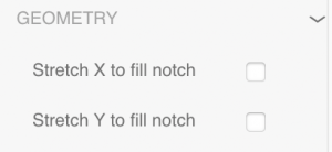
Stretch X to Fill Notch – This property will only show up if the element is touching the left or right edges of the screen. Selecting this property will extend the element to go below the “notch” of the phone, if there is one, in the x-direction. This will only work on iOS.
Stretch Y to Fill Notch – This property will only show up if the element is touching the top or bottom edges of the screen. Selecting this property will extend the element to go below the “notch” of the phone, if there is one, in the y-direction. This will only work on iOS.
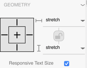
Responsive Text Resize – This property only exists for Text Elements. If selected (the default), then the text size will change as the screen size changes. This makes it easy to maintain the placement of text and stops text from being cut off.
Going Beyond Geometry
Using the geometry settings in Appli can give us better control over how our apps look at different screen sizes. It may even allow us to deploy to completely different form factors, such as deploying a phone app to a tablet. In order to best utilize these properties, we also need to be deliberate in the way we lay out our apps, so that they will work well at different aspect ratios and different size devices. Generally speaking, it’s best to design for a small screen, and then have your app grow larger, versus designing for a larger screen. This will help keep text readable, and will ensure that our buttons and other touch points are large enough. Moreover, we should consider how things will change when a user’s device has a different aspect ratio than what we originally designed for. Especially for things like images, we may want to use boxing or cropping so that the image doesn’t look stretched, or we may want to maintain aspect ratios. The more thought we put into our designs, the better the experience for our users, regardless of their device.


