When creating a new application, it is easy to add too many elements to a screen, making element management a needlessly complex task. You may recognize this stage of development as you create many groups on the screen and have low-code scripts to reveal and hide them as needed.
Such a pile of complexity happens because many of us attempt to group all functionality related to a specific activity or data into a single screen. In a complex CRM application, one might attempt to cram all possible operations of contact management into a single screen, for example. Reasoning about features and element management then becomes a lot harder than it should be. Before moving on to potential solutions, let me explore the problem a bit more with examples you might have seen in your own work.
Minor features packed into dialog boxes
Consider an app with a complex form that has some auxiliary features tackled into it. That form is used to edit data, but it also contains some buttons that unlock extra features. Sometimes these features require some additional user interface that you don’t want to be visible all the time on the screen, so you create a group for it and hide it until it is necessary.
As you build more and more of such small tools and groups, your screen becomes harder to manage. The project browser becomes too long, the argument pop-ups for element selection in the low-code editor too busy. All because instead of creating a new screen for those features, you packed them all onto the same screen.
Unrelated features on the same screen
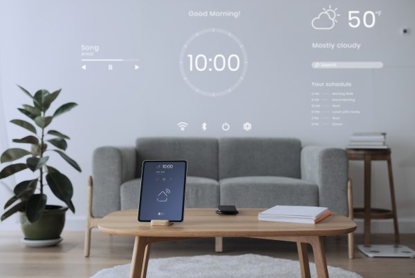
The smaller the screen, the larger the problem this becomes. On a desktop or tablet, you can get away packing unrelated features on the same screen. Seeing contacts and tasks at the same time can be valuable, but on a mobile screen, this leads to a very busy screen.
Attempting to build the whole app on a single screen
Developers at the beginning of their journey will often attempt to put the whole app into a single screen. Thinking in terms of multiple screens is one skill they’ll gain early, but not from the very start.
So, what is the core of the problem, anyway?
All the situations described above lead to an overwhelming amount of elements and logic on a single screen. Appli can handle all that with ease. That complexity is hard for humans, though.
You’ll immediately notice it when you see the very long list of elements in the project browser and end up relying on the search box to find the element you need.
Too many elements also make the element pop-up selection harder on low-code scripts. Again, you’ll probably end up searching more than scrolling if the list is too long.
And more important than all that, every time you need to add a feature, you face a bit of paralysis trying to think where to cram that into the current screen.
The solution is straightforward
Instead, design your app breaking distinct features into their own screens. Don’t over use dialog boxes, add new screens. Keep unrelated features on their own screens. Going from a screen to another doesn’t necessarily involve the user knowing they navigated to a new screen. You can have screens that look very similar but have distinct features, thus separating their scripts and making them easier to maintain.