If you’re a citizen developer or expert, you might be constantly thinking about optimizing your team’s productivity or simply delivering a good solution to a specific industry — you’re excited to get your ideas moving, but UI design isn’t necessarily on your radar. So, you take to low-code/no-code tools to increase rapid development without sacrificing app quality. But there’s one problem: How can you make your app’s UI look visually appealing for users?
Aesthetics are just as important as functionality when it comes to crafting practical solutions or drawing people into an app. In fact, 92.6% of people expressed that visuals are an important factor when making a purchase.
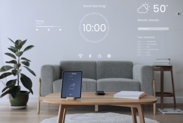
Because users will be using this mobile or desktop app for as long as they need, making it a pleasant and intuitive experience is prime. Thankfully, you don’t need to be a design expert to make an app that’s usable and appealing. It’s all a matter of covering a few key design aspects that will take your app from good to great.
1. Aim For Simplicity and Intuitiveness
Nothing drives people away like cluttered and confusing visuals — there’s a reason why minimalism continues to be an app design trend time and time again. This means simplicity is king as it allows people’s eyes to easily find their way around an app and makes for a pleasant visual experience.
Here are a few ways to achieve simple visuals:
- Write short and straightforward prompts
- Use icons to represent actions or categories
- Keep UI elements consistent across app screens
- Maintain the same tone and style in your copy (formal, upbeat, engaging, etc)
It’s also important to keep things familiar for users so navigating the app is an intuitive endeavor. Apps have been around for long enough, with tried-and-true elements that build a winning UI design formula. For example, leaving app actions at the bottom tab bar, including a hamburger menu, placing the back button on the upper left corner of the screen, pull to refresh, and including a search tab.
2. Prioritize Ease of Use For Everyone
One of the best features of successful technology is democratization. Everyone should be able to use and enjoy apps, including those built by citizen developers for their companies and developers looking to launch innovative solutions to the public. This is why app UI design must also be accessible to everyone, especially people with disabilities.
One way to improve accessibility in your app’s design is to follow Web Content Accessibility Guidelines (WCAG) recommendations for proper color contrast in your text. Color blind people might have trouble reading text with certain color combinations, which is why contract ratios have been created: 4.5:1 between text and background colors for normal text, and a ratio of 3:1 for larger text.
On the same visual note, you can build your app with a standardized font size but offer the option to resize the text without breaking the layout. This can ensure that anyone, including those visually impaired, can adjust your app to their needs.
Lastly, it’s important to increase comfort and the ability to multitask when using your app. Consider designing the app for one-handed use, which is how most people hold their phones nowadays. That way, people can browse it while on their desktop at work, or in the middle of other activities.
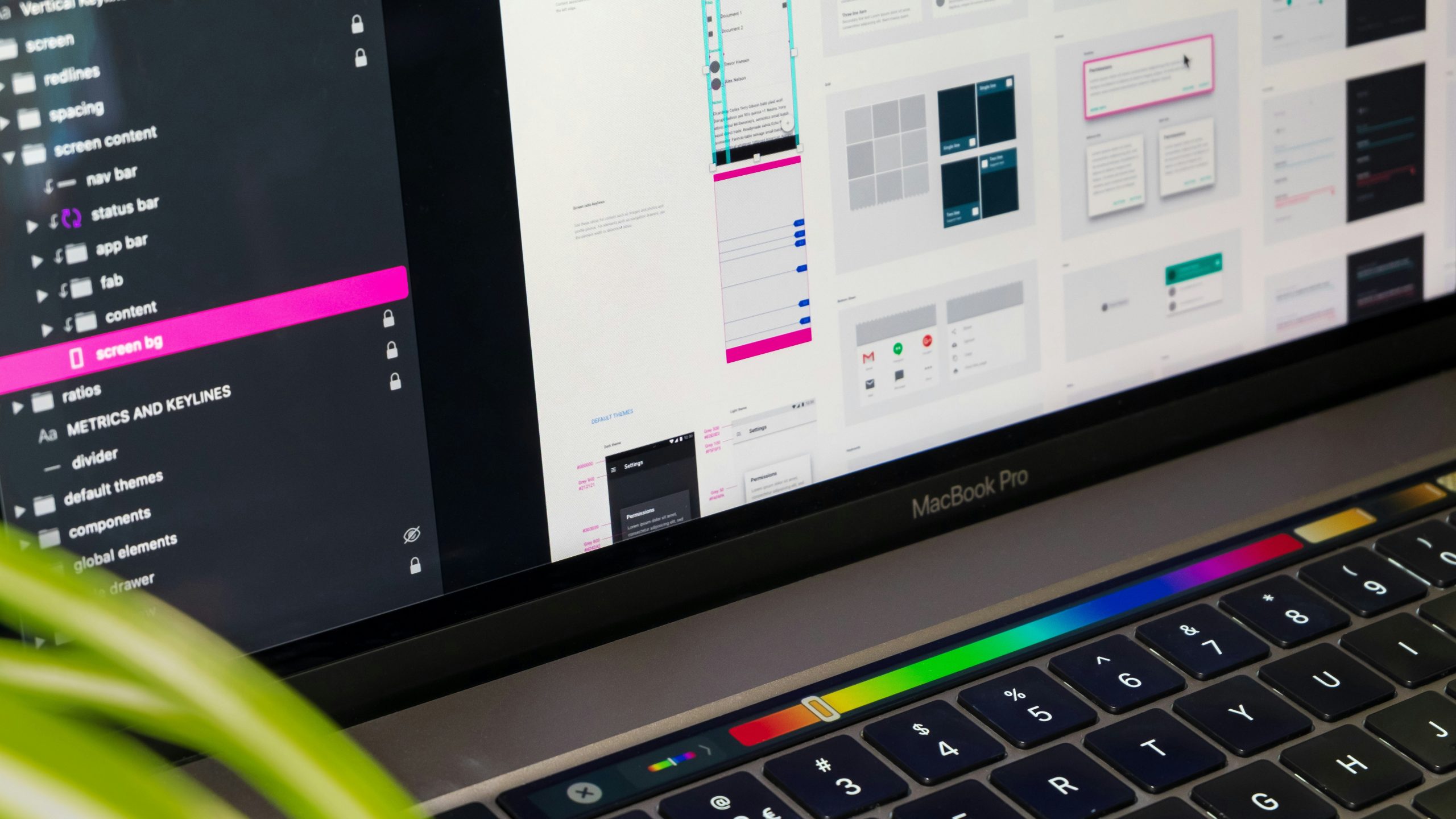
3. Coordinate Every Visual Aspect
UI design is all about using visual elements strategically to draw attention or drive away looks when necessary. This is why following visual hierarchies is crucial when creating your app, ensuring users don’t have to go through lots of trouble to find important features or move around.
When designing the layout, know which actions you want to prioritize and design them accordingly. For instance, Call to Action (CTA) buttons should be highlighted in contrasting colors to prompt users to take the right steps. If you want them to do something in specific, make sure the CTA button is larger than secondary elements and positioned prominently on the screen to draw the eye.
What you don’t include also speaks volumes: Use white space effectively. For example, CTAs should have ample space around them so tapping them is easier, while you can group together related items so users know where to find them.
Low-code/no-code platforms like Appli include visual guides and grids for you to easily space your items.
For example, in a healthcare app, you might want to leave bigger gaps between sections in the “Make an appointment” tab, that way people can easily tell the difference between making a doctor or dentist appointment.
4. Follow Consistent Color Patterns
Colors play a major part in building a visually appealing app. And, while you may have many favorites, it’s best to limit yourself and include only a few shades consistently throughout every screen. This creates visual harmony that also helps users navigate the app intuitively.
The first thing you must do is establish a color palette of no more than 5 tones that work well together, defining a primary color, secondary ones, and accents to apply sparingly for specific elements like CTAs. These can come from your own inspiration or from pre-established brand guidelines.
An easy way to navigate matching colors is by basing yourself on the color wheel and using color theory, which helps guide you through color harmony and picking the best colors to achieve it.
As you pick your colors, you must use these consistently to build the feeling of familiarity for users.
Losing track of your own rules is easy in the midst of designing an app, so build a color usage guide for yourself to avoid breaking your patterns whether before launching or creating new sections as needed.
5. Optimize UI Design Anywhere You Can
Optimizing visuals and UI design means making sure they’re up to standard, tweaking elements if needed whenever you make updates or changes. For example, implementing assets in the same image format (PNG for graphics, JPEG for images, SVG for icons and logos) keeps things tidy.
Another key aspect of optimization is using images in appropriate resolutions — nothing says unappealing quite like a blurry background picture or asset. Likewise, going above the required resolution might make your app lag and crash, so consistency in file format is paramount.
Additionally, if you’re including animations and transitions between screens, it’s best to keep them as simple as possible and standardize their timing. Simplifying them helps make your app dynamic without distracting users and keeps things to the point, only applying movement if it has a purpose.
Designing your app doesn’t have to be the complex task people make it out to be. More often than not, design is rooted in logic, which is what experts and citizen developers do best. Infusing visual hierarchy, color harmony, accessibility, optimizations, and intuitiveness into your app will elevate it to higher standards, giving users a pleasant experience as they get their tasks done. Bringing solutions is all about combining practicality with aesthetic accents that leave users satisfied and wanting to come back!
Ready to build your next app? Download the Appli Builder and design, develop, and deploy your project effortlessly!